The U.S. Soccer Federation Reveals New Logo Through Digital Media Campaign
The power of America – the new crest that graces the front of the national team jersey provides players and fans with a strong and proud connection to their team and their country as they watch the players take to the pitch. U.S. Soccer revealed its new logo on social media Monday as the federation rebrands for the first time in over 20 years ahead of an eventful summer for the Men’s and Women’s National Teams.
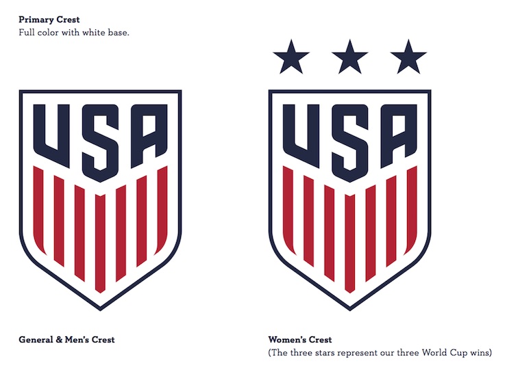
Soccer News: The U.S. Soccer Federation has officially revealed its new crest — a landmark rebrand for the first time since 1995.
The new U.S. Soccer logo is bold and strong – drawing from the history of the United States including the thirteen stripes representing our founding colonies along with a strong USA across the top of the crest — and, perhaps most importantly, the three beautiful stars on top of the Women’s crest which reflect the 1991, 1999, and 2015 World Cup championships won by the USWNT.
“This design embodies the spirit of U.S. Soccer, but it also transcends our teams and the game. It’s uniquely and unmistakably American,” said U.S. Soccer in its press release.
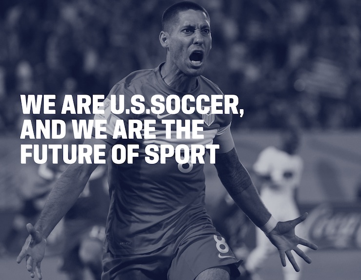
U.S. Soccer launched a social media campaign to reveal the new logo that was designed along with chief sponsor Nike. U.S. National Team players Jozy Altidore, Geoff Cameron and Alex Morgan all took to social media to reveal the crest as well as U.S. Soccer making a push through a virtual reality campaign. Below is a powerful image of soccer star Clint Dempsey with the simple yet powerful saying that “We are U.S. Soccer, and we are the future of the sport.”
Last week, U.S. Soccer signaled a change was coming as they removed the previous crest from its sites as well as posted a video showing the old crest being removed from its headquarters in Chicago.
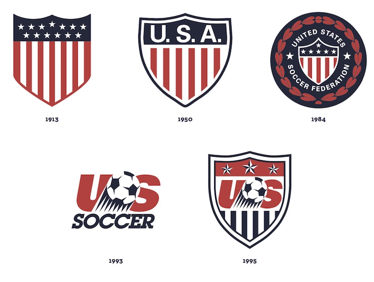
The Heritage of the U.S. Soccer crest is a tale of dedication, improvisation and style, reflecting the road traveled to the present. “Founded in 1913 as the United States Football Association, U.S. Soccer was one of the world’s first organizations to be affiliated with FIFA, soccer’s world governing body, and has grown into one of the sport’s organizational leaders, integrating player participation and player development into a comprehensive top-to- bottom National Team program,” states the U.S. Soccer brand guidelines.
U.S. Soccer — now with a greater impact on the world stage than ever before, has forged the path of the world’s greatest sport in our country for more than 100 years. The goal has always been the same.
The Federation’s mission statement has been clear and simple: to make soccer a preeminent sport in the United States.
When looking at the evolution of the U.S. Soccer logo, one travels back in time to when soccer first emerged as a sport in the USA.

The goal of the new logo was to create a strong visual identity for U.S. Soccer – and one that was bold youthful and aggressive. A crest that fans would be proud to wear.

AGGRESSIVE
There is a sense of accomplishment and an aggressiveness to the design — as if the crest is speaking the words of the branding …
We continue to fight for our stars. We have the will to win and will not rest in our pursuit of victory.
The crest comes ahead of an eventful summer that will see the United States host the inaugural Copa America Centenario as well as the U.S. Men’s and Women’s National Teams heading down to Brazil for the 2016 Olympics. Will fans run out and but new gear with this logo ahead of next month’s Men’s World Cup qualifiers?
When the new crest officially takes the pitch as the U.S. faces Guatemala in a World Cup Qualifier match on March 25th, we expect the audience to great their team clad in this power logo – clearly showing support for our country.
View below U.S. Soccer’s virtual reality campaign for the new crest that will represent the United States for years to come!
As the Head Coach of the Men’s National Soccer Team says,
When there’s enough will and aggression, there’s no shortage of talent.
—Jurgen Klinsmann
Photo Credit: U.S. Soccer


