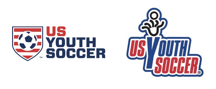
A New Look For US Youth Soccer
Marking a most dramatic change in its visual identity, US Youth Soccer launches a new, modern redesign.
What does changing a logo mean? Today it can signal a fresh new approach. Gone are the days when expert business advice dictated to never rebrand. We have ushered in a new era of brand revitalization with brand redesigns and name changes.
Today, US Youth Soccer, the largest youth sport organization in the United States, announced a complete redesign of its brand.
The refreshed look and feel reflects the organization’s commitment to making soccer the preeminent youth sport in America.
“Our new brand identity and architecture is a true reflection of our mission, core values and the recent evolution of our governance,” said Chris Moore, CEO of US Youth Soccer.

What is new? The visual identity is strong with a powerful and attractive logo that players will wear with pride.
US Youth Soccer has 55 Member State Associations with over 3 million players, 10,000 clubs and leagues, and nearly 1 million administrators, coaches and volunteers.
“The new brand — which is a modern, cohesive design full of energy and passion for our purpose – is a metaphor for US Youth Soccer,” said Moore.
“From our modern new crest to the bold and clean event logos, the new brand projects strength and emphasizes our leadership position within the youth soccer landscape and our ongoing commitment to serving every player, coach, referee, and community, while also serving our membership,” said Moore.
“The rebrand is a great representation of our goal to unify youth soccer in America,” said Dr. Pete Zopfi, chair of U.S. Youth Soccer. “It expands beyond our organization and provides a functional framework for us to grow the game from the youth to adulthood. It is one more step toward creating participants and fans for life in soccer.”
“Making soccer the preeminent sport” are words we have heard spoken by U.S. Soccer, the governing organization of soccer in the USA. The obvious goal is to increase participation in the sport and create a stronger soccer culture that starts with our young wanting to learn the game, our teenagers staying in the sport and our adults becoming lifelong fans of the beautiful game.
As the largest organization in youth soccer, US Youth Soccer has a large responsibility in accomplishing this mission. This new shield is a step forward, connecting with today’s players and shinning a bright light on their many pathways to play the game in the USA.

In a letter written to the members of US Youth Soccer, Moore said, “Our new identity exemplifies the evolution of our brand and the commitment we are making to innovate and put the player at the center of eveything we do.”
“The rebrand is more than just a logo change,” said Moore.
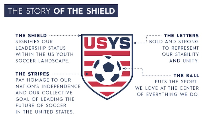
The brand redesign was a collaborative and inclusive process comprised of several US Youth Soccer members and staff, resulting in a new masterbrand that showcases the following elements:

US Youth Soccer’s new Brand Platform
- The Shield: A badge of honor that signifies US Youth Soccer’s leadership status within youth soccer.
- The Stripes: Pays homage to America’s independence and US Youth Soccer’s collective goal of leading the future of soccer in the United States.
- The Letters: Bold and strong to represent US Youth Soccer’s stability and unity.
- The Ball: Places the sport we love at the center of everything we do.
US Youth Soccer has undergone a number of governance, operational and programmatic changes in the last 2 years. From Moore’s perspective, and he said, “the new brand reflects this evolution, along with our ongoing commitment to tell our story, serve our members and drive our mission forward.”
 Two years in the making:
The project to create the new US Youth Soccer logo was started nearly two years ago. SME, a strategic branding agency guided the US Youth Soccer through the rebrand which entailed hundreds of hours of stakeholder interviews, positioning research, strategic planning and creative executions.
“We were tasked with streamlining and modernizing the USYS brand to establish a clean, cohesive and scalable look across all properties and assets, while clearly communicating a national structure for competition, top programming, education and development,” said Ed O’Hara, President of SME.


